news
newsletter
archive
imprint
PawelAlthamer | MichaelAsher | NairyBaghramian | GuyBen-Ner | GuillaumeBijl | MartinBoyce | Jeremy Deller | MichaelElmgreen und IngarDragset | Hans-PeterFeldmann | DoraGarcia |
IsaGenzken | DominiqueGonzalez-Foerster | TueGreenfort | DavidHammons | ValérieJouve | MikeKelley | Suchan Kinoshita | MarkoLehanka | GustavMetzger | EvaMeyer und EranSchaerf | DeimantasNarkevicius | BruceNauman | MariaPask |
ManfredPernice | SusanPhilipsz | MarthaRosler | ThomasSchütte | AndreasSiekmann | RosemarieTrockel | SilkeWagner | MarkWallinger | Clemens von Wedemeyer | AnnetteWehrmann | PaeWhite

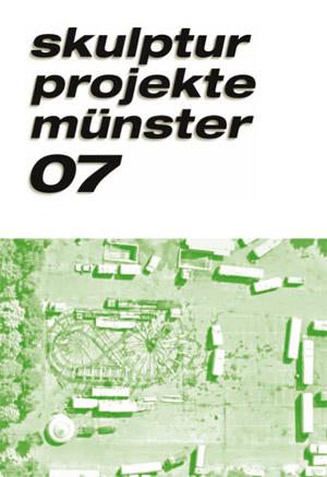
The Skulptur Projekte exhibition takes place every ten years, an interval that makes it possible to reflect upon and analyze real changes within public urban space. But it also means that the name Skulptur Projekte needs to re-establish itself each time. The visual identity of skulptur projekte münster 07 is clear and to the point. It thus lives up to the conviction that the purpose of art is not to brighten up or decorate urban space, but rather to reflect critically on the tendency to use art as a decorative instrument. The typeface for this years exhibition was chosen by the exhibitions curators, Kasper König, Brigitte Franzen, and Carina Plath, back in the summer of 2005. It was designed by the artist Martin Schmidl.

The exhibition logo for skulptur projekte münster 07, a line of text about fifteen meters in length, has been installed on the building in which the project office is located, above a row of windows and on the left-hand side of the façade. Seen as a sculpture, this installation explores issues surrounding marketing and public presentation. To achieve this, the lettering has been transferred to a weatherproof surface using gold-colored foil. The color is a reference to the gold lettering chosen out of marketing considerations to create a sense of luxury and value on the many shop fronts between Prinzipalmarkt and Aegidimarkt. This approach is not unique to Münster, but in this location it is particularly apparent and has the function of a public statement. Thus, Martin Schmidls work addresses questions about arts purpose or lack of purpose in the public sphere. What does it mean when the logo of an art project appears in the same guise as the lettering above an expensive clothing boutique? And what happens, in this context, when visitors look more closely and realize that the exclusive gold of the lettering is nothing but cheap foil? Especially from the perspective of the larger national and international audience, major art projects like these are expected to innovate. And because it is internationally renowned, Skulptur Projekte has to prove time and again that it will not rest on its (golden) laurels. As part of our visual identity, gold is being consciously misused because it is normally associated with value and tradition. By matching the sand-colored stone of the façade, the color draws new attention to the building and location, creating a subtle and productive sense of distance and reflection once the viewer realizes that the gold is not precious, but false. The visual identity designed by Martin Schmidl for skulptur projekte münster 07 can be seen in all of our publications, on our website, on postcards, and in our advertisements.